How publishers use mission and brand messaging in subscription journeys
2026-06-094 min read
2026-06-094 min read

Where mission shows up, how it shapes conversion, and what publisher teams should test next
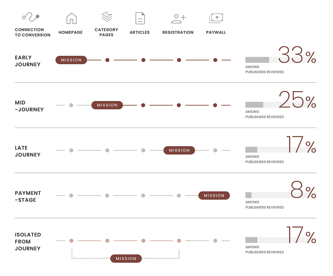
Subscription messaging is not only about access, price, or offers. For many publishers, it is also about identity: what the brand stands for, why the journalism matters, and why a reader should support it now.
We recently mapped how a range of leading publishers handle this across their subscription journeys. The patterns were clear. There is no single formula, but there are recognisable strategic choices — and some are much more effective than others.
For publisher teams, one of the hardest messaging questions is also one of the most strategic:
Not whether to talk about it at all. Most premium publishers already do, in some form. The real question is where it belongs, how often it should appear, and how closely it should sit to conversion.
Some introduce it early, through homepage sections, editorial framing, or persistent navigation links. Others hold it closer to the moment of conversion, using registration prompts, paywalls, or support messaging to connect subscription directly to purpose. Others keep it more separate, limiting it to brand pages or About sections.
That choice matters more than it may seem.

When mission appears early, it helps build context. It gives readers a clearer sense of what the publication stands for before any ask appears. When it shows up only at the paywall, it becomes more of a justification for payment. And when it sits too far away from the journey entirely, it may feel less intrusive — but also less useful.
“Placement changes meaning.
The same message can build brand context, justify payment, or feel completely out of place depending on where it appears.”
Across the competitor journeys we reviewed, article pages carried the heaviest load.
This is where publishers most often combine:
For teams working on conversion, this is an important shift in thinking. The article page is not only where the ask happens. It is also where the value of the ask can be made clearer.
The strongest messaging feels integrated, not bolted on.
A second pattern was just as clear: the best approaches feel integrated with the subscription journey, not layered awkwardly on top of it.
A sticky bar, an in-content prompt, a ribbon, or a support message can all work. The real question is whether the message fits:
One of the biggest mistakes publisher teams make is treating mission and value messaging as something separate from optimisation.
In practice, they are part of the same journey.
If readers are only asked to subscribe, without being helped to understand why the relationship matters, the conversion moment becomes harder. If the value of subscribing is built earlier and more consistently, the ask feels more natural.
That is where stronger subscription journeys tend to differ.
The full analysis includes a broader comparison framework, pattern mapping across publishers, and practical prompts for publisher teams, including:
See how leading publishers place mission, value, and brand messaging across homepage, article, registration, and paywall journeys — and what those patterns suggest publisher teams should test next. 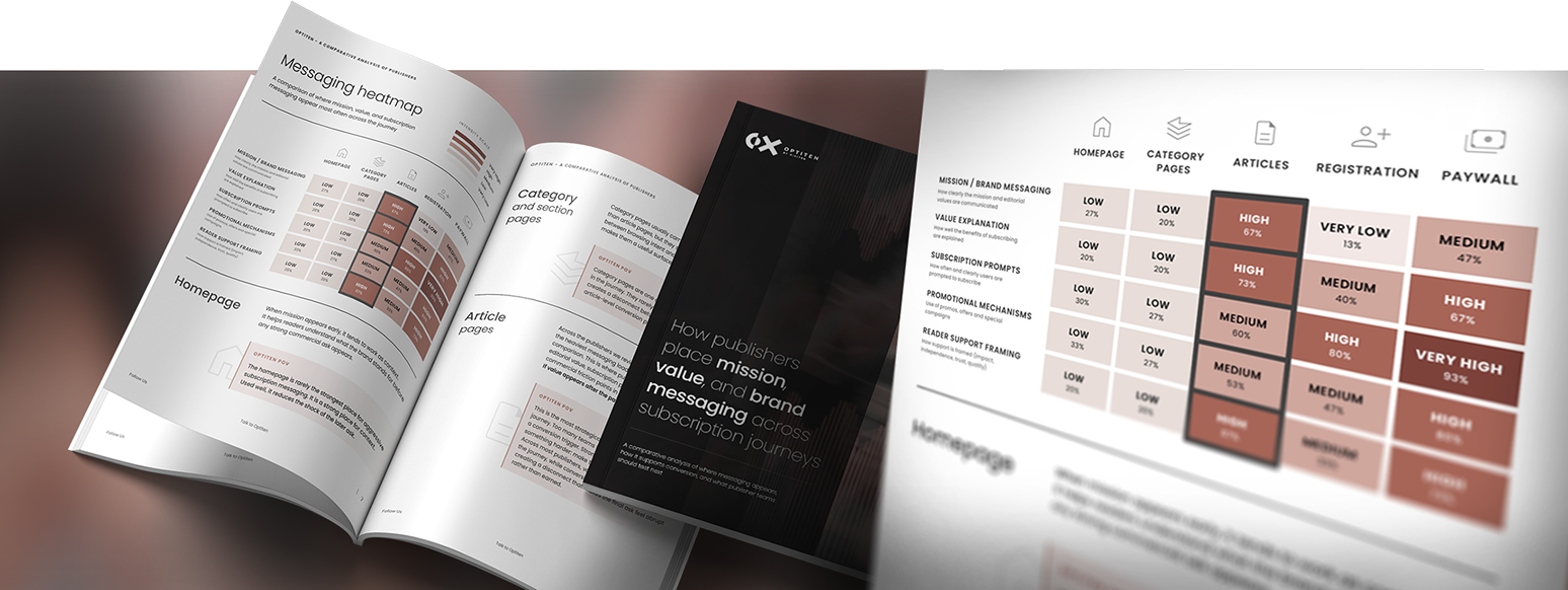
Request a subscription journey audit
Request your audit