Piano audit for publishers: where to start and what to check first
2026-06-0915 min read
2026-06-0915 min read

A Piano audit should not start with the paywall.
That may sound counterintuitive. For many publisher teams, the paywall is the most visible part of the setup. It is where the commercial ask happens, where conversion is measured, and where internal debates often concentrate.
But in most publisher subscription journeys, the paywall is not the whole story. It is only one point in a wider system.
If registration is badly timed, the offer is unclear, the checkout journey creates friction, onboarding is weak, or reporting cannot be trusted, a paywall review on its own will only tell part of the truth.
That is why a useful Piano audit for publishers needs to look beyond whether Piano is technically working. The better question is whether Piano is helping the publisher build a stronger subscription business.
The paywall gets blamed because it is visible.
When conversion is lower than expected, it is easy to ask:
Those are valid questions. But they are not always the first questions.
For publishers, Piano performance depends on everything that happens before and after the paywall. The reader’s willingness to register or subscribe is shaped by the article experience, the value proposition, the timing of the ask, the clarity of the offer, the ease of checkout, and the quality of the post-conversion experience.
A weak journey can make a reasonable paywall look ineffective. A fragmented setup can make good offers underperform. Poor reporting can make successful experiments look inconclusive.
So the first principle of a Piano audit is simple:
Do not audit the wall in isolation. Audit the subscription journey around it.
This is where many publisher teams find the biggest opportunities. The issue is often not that Piano has been implemented incorrectly. It is that the setup has not been optimised around how readers actually move from unknown visitor to registered user, subscriber, and retained customer.
A Piano audit for publishers is a structured review of how Piano is supporting subscription performance across registration, paywalls, offers, checkout, onboarding, experimentation, reporting, and retention.
It should answer three practical questions:
Is the current Piano setup working as intended?
Is it supporting the publisher’s subscription strategy?
Where is it creating friction, missed subscription value, or operational drag?
A good audit is not just a technical health check. It should combine technical review, journey analysis, commercial logic, UX assessment, and reporting review.
That matters because publishers rarely struggle with only one isolated part of Piano. The issue is more often how the pieces connect.
For example:
That is why the best Piano audits look at the whole subscription system, not just the platform settings.
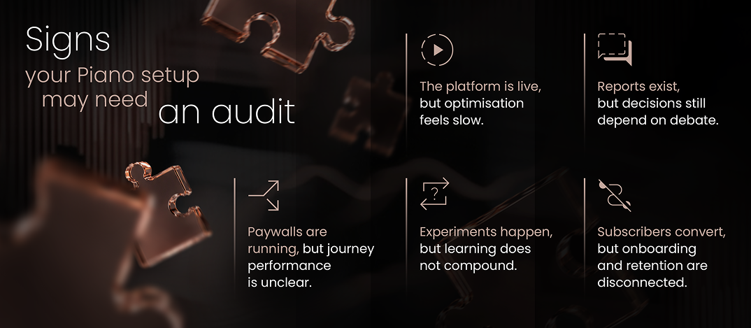
A publisher should consider a Piano audit when the platform is live but performance, confidence, or operational clarity is weaker than expected.
Common signs include:
The most important sign is not one bad metric. It is a lack of confidence.
If the team cannot clearly explain how Piano is supporting reader revenue growth, where the biggest journey friction sits, and what should be improved next, the setup is ready for an audit.
Start with the subscription journey, not the platform configuration.
The wrong way to start a Piano audit is to open the platform and immediately inspect every configuration detail.
That work matters, but it should not come first.
The first step is to map the actual subscription journey from the reader’s point of view. This helps the team see where Piano is supporting the journey, where it is creating friction, and where the setup no longer matches the publisher’s commercial goals.
A useful journey review should include six areas.
1. Article experience
For many publishers, the subscription journey begins on the article page.
This is where readers first experience the value of the product. It is also where they encounter prompts, registration messages, newsletter asks, subscription cues, and paywall triggers.
A Piano audit should ask:
If the article experience does not prepare the reader for the ask, the paywall has to do too much work.
2. Registration
Registration is often treated as a technical step. Readers experience it as an exchange.
They are being asked to give time, attention, and personal data. If the value of that exchange is unclear, registration becomes friction.
A Piano audit should review:
This is especially important because registration can support more than one goal. It can help with first-party data, engagement, identity, propensity modelling, and future subscription conversion. But it only works if the journey makes sense to the reader.
3. Paywall and offer logic
A paywall audit should not only ask whether the wall converts.
It should ask whether the right readers are seeing the right ask at the right time.
Key questions include:
Dynamic paywalls and audience segmentation can be powerful, but only when the underlying strategy is clear. If the basic logic is weak, dynamic rules can scale confusion rather than solve it.
This is why a Piano implementation audit should look at both configuration and commercial reasoning.
4. Checkout and entitlement flow
Checkout is where interest becomes commitment.
Small points of friction matter here. Confusing price presentation, limited payment options, unnecessary account steps, poor mobile experience, entitlement issues, or unclear confirmation messages can all weaken performance.
A Piano audit should check:
This is not just a UX issue. It affects revenue quality, customer satisfaction, support burden, and early subscriber confidence.
5. Onboarding and retention
A subscription journey does not end when payment is completed.
For publishers, the first moments after conversion are commercially important. This is when the subscriber should understand what they now have access to, what to do next, and how to get value quickly.
A Piano audit should ask:
6. Reporting and experimentation
Reporting is where many Piano setups quietly lose momentum.
The issue is not always that data is missing. More often, the problem is that the reporting model does not create enough confidence for decision-making.
A Piano audit should review:
The goal is not more dashboards. The goal is decision-ready reporting.
If teams cannot trust experiment results, compare journeys, or understand where users drop off, optimisation becomes slower and more political than it needs to be.
A practical Piano audit for publishers should cover five areas.
| Audit area | What to check | Why it matters |
|
Journey logic |
How users move from article to registration, paywall, offer, checkout, and onboarding |
Shows where friction appears before conversion |
|
Commercial setup |
Paywall rules, offer structure, pricing logic, audience segmentation |
Reveals whether Piano supports the subscription strategy |
|
UX and messaging |
Value proposition, prompts, registration copy, offer clarity, confirmation messages |
Shows whether users understand why to act |
|
Experimentation |
Test structure, success metrics, readouts, learning process |
Shows whether optimisation is disciplined or ad hoc |
|
Reporting |
Data definitions, dashboards, ownership, KPI confidence |
Shows whether teams can make reliable decisions |
This framework keeps the audit focused. It prevents the work from becoming either too technical or too vague.
A weak Piano setup is not always broken.
In fact, that is what makes it difficult to spot. The system may be live, but not commercially sharp.
|
A weak Piano setup |
A stronger Piano setup |
|
Paywall is live |
Paywall is connected to audience and offer strategy |
|
Registration exists |
Registration has a clear value exchange |
|
Offers can be launched |
Offer architecture is easy to test and govern |
|
Experiments happen occasionally |
Testing follows a clear learning roadmap |
|
Reports are available |
Reporting is trusted and decision-ready |
|
Subscribers convert |
Subscribers are onboarded and activated |
|
Teams can make changes |
Teams can improve the setup without creating fragility |
This distinction matters because many publishers do not need a full rebuild. They need to identify where the current setup is limiting performance and where targeted optimisation would create the most leverage.
If a publisher is not sure where to begin, the audit should start with the areas most likely to affect subscription performance.
1. Check whether the journey is coherent
The first question is whether the reader journey makes sense.
Does the path from article to registration to subscription feel connected? Or does each step feel like it belongs to a different team?
A coherent journey should have clear progression:
If that progression is missing, paywall optimisation alone will have limited impact.
2. Check whether value is introduced early enough
Many publisher journeys introduce the subscription value proposition too late.
If the first serious explanation of value appears at the paywall, the message has to work very hard. It is trying to explain the product, justify the price, reduce hesitation, and drive action all at once.
A stronger journey builds value earlier through:
A Piano audit should identify where value is currently introduced and whether that timing is strong enough.
3. Check whether registration helps or hurts the journey
Registration can be valuable, but only if it is designed with care.
If it appears too early, too abruptly, or without a clear benefit, it can suppress momentum. If it appears at the right moment with a clear exchange, it can support identity, engagement, data quality, and future conversion.
A good audit should ask:
Registration should not be just a gate. It should be part of a relationship-building strategy.
4. Check whether experiments are producing useful learning
Testing is only useful if the team can understand what changed and why it mattered.
A Piano audit should review whether experiments have:
A test that improves click-through but weakens subscriber quality may not be a win. A test that increases starts but creates higher churn risk may need a more careful reading.
The point of experimentation is not activity. It is learning that compounds.
5. Check whether reporting is trusted
Reporting is often the difference between a setup that improves and a setup that stalls.
If teams do not trust the numbers, optimisation slows down. Product, subscription, editorial, CRM, and commercial teams can all end up looking at different versions of performance.
A Piano audit should check whether everyone agrees on:
Without this, the business may have data but not clarity.

The output of a Piano audit should not be a long list of disconnected issues.
It should produce a prioritised roadmap.
A useful roadmap should separate findings into three groups:
1. Fix now
These are issues that create immediate friction or measurement risk.
Examples include:
2. Optimise next
These are areas where the setup works but could perform better.
Examples include:
3. Build over time
These are larger improvements that require more planning.
Examples include:
This structure helps teams move from audit to action. It also avoids the common problem of identifying too many issues without deciding what matters most.
A Piano audit should not be treated as a generic website review. Publisher subscription systems have their own logic. A strong audit needs to understand editorial value, reader behaviour, subscription economics, product constraints, commercial pressure, and the operational reality of publisher teams.
A publisher does not need a cleaner Piano setup for its own sake. It needs a setup that makes the subscription business easier to improve.
It needs a setup that makes the subscription business easier to improve.
That means:
A Piano implementation audit is often the best starting point when a publisher already has Piano live but cannot clearly see where performance is being lost.
The purpose of a Piano audit is not to produce a document.
The purpose is to create clarity.
Where is the journey leaking value? Where is the setup too hard to change? Where are users being asked to act without enough context? Where are experiments failing to produce learning? Where is reporting creating debate instead of decisions?
Those are the questions that matter.
For publishers, Piano can be more than a paywall or registration tool. It can be core subscription infrastructure. But only if the setup is aligned with the way readers actually move, decide, subscribe, engage, and stay.
That is why the best place to start is not the platform screen.
It is the journey.
Not sure where your Piano setup is losing value? Optiten can help you audit the journey, identify friction, and prioritise the changes most likely to improve subscription performance.
Request a subscription journey audit
Request your audit2026-06-0913 min read

Most Piano implementations do not fail in an obvious way.
The paywall goes live. Registration works. Offers can be launched. Journeys technically exist. Reporting is available. On paper, the implementation is done.
And yet, a few months later, the same questions start surfacing inside the publisher team:
Why is conversion lower than expected?
Why are experiments hard to trust?
Why does reporting feel fragmented?
Why is onboarding disconnected from the subscription journey?
Why does the setup feel harder to evolve than it should?
That is the real issue.
For publishers, the biggest Piano implementation mistakes are rarely just technical mistakes. More often, they are strategic, operational, and commercial mistakes that get locked into the implementation itself.
A publisher can have Piano live and still be underusing it. They can have paywalls running and still be leaking value across registration, subscription, onboarding, retention, and reporting. They can have a system that works — but does not work hard enough.
That is the distinction that matters.
This article is for publisher product teams, subscription teams, growth leaders, and digital transformation stakeholders who use Piano and want to pressure-test whether their implementation is actually helping the business grow.
|
A live Piano setup |
A high-performing Piano setup |
|
Paywall is launched |
Paywall is tied to audience and offer strategy |
|
Registration exists |
Registration supports data, conversion, and engagement goals |
|
Checkout works |
Checkout is optimised and measured properly |
|
Reports are available |
Reporting is trusted and action-oriented |
|
Experiments happen occasionally |
Experimentation is structured and continuous |
|
Subscribers convert |
Subscribers are also onboarded and retained |
This is the mistake underneath many of the others.
Too often, Piano gets treated as a platform rollout: scope the work, configure the journeys, launch the wall, connect the key components, then move on.
But for publishers, Piano sits much closer to the core of the subscription business than that. It affects how value is presented, how registration works, how subscription journeys are structured, how users are segmented, how experiments are run, and how conversion and retention are measured.
In other words, it is not just implementation work. It is subscription infrastructure.
If a publisher treats Piano as a one-time delivery project, the setup often ends up with the wrong shape:
A good implementation should not just make Piano usable. It should make it easier to improve subscription performance over time.
A useful test
A simple question for any publisher team is this:
Did we implement Piano in a way that makes future optimisation easier — or harder?
If every change still feels slow, every experiment feels bespoke, and every reporting conversation turns into a debate about definitions, the implementation may be live, but it is not mature.
The paywall gets the most attention because it is the most visible part of the setup. It is where revenue logic becomes visible to the reader, and it is often the part stakeholders care about most during launch.
But a paywall is only one moment in a wider journey.
If the surrounding system is weak, the paywall will often expose that weakness rather than fix it.
A publisher can launch a perfectly functional wall and still underperform if:
This is one of the most common Piano implementation problems in publishing: too much effort goes into the trigger, and not enough goes into the path that follows it.
What publishers should pressure-test
Before focusing on paywall performance alone, teams should ask:
The strongest Piano setups do not isolate the paywall from the rest of the journey. They treat registration, subscription, and onboarding as one connected commercial flow.
One of the clearest signs of a weak implementation is when the setup reflects the publisher’s org chart more clearly than it reflects the reader journey.
This happens all the time.
The marketing team needs one thing. Product wants another. Editorial has campaign requirements. CRM has its own logic. Commercial teams want fast changes. Data teams want clean measurement. None of those needs are unreasonable, but when internal structures shape the setup too much, the reader experience suffers.
Readers do not move through a publisher subscription journey according to departmental boundaries. They move according to habit, value perception, content preference, frequency, propensity, and timing.
That means a Piano implementation needs to be structured around actual audience behaviour:
When internal alignment is weak, Piano often becomes a place where competing business logics are layered on top of each other. The result is usually complexity without clarity.
What better looks like
A better implementation starts with a few simple behavioural questions:
This is where specialist implementation matters. The challenge is not just building logic. It is building logic that maps to how publisher audiences actually behave.
Piano gives publishers a lot of control. That is one of its strengths.
It is also why teams can get into trouble quickly.
Once the platform is available, the temptation is to build:
This can feel sophisticated. It can also make the whole setup harder to operate, harder to explain, and harder to improve.
The problem is not complexity itself. The problem is premature complexity.
If a publisher adds too much logic before it has learned enough from the basics, it often ends up with a setup that is expensive to maintain but not especially strong at generating insight.
Where complexity becomes a problem
Complexity becomes harmful when:
A strong implementation does not start by trying to be exhaustive. It starts by being clear.
|
Useful complexity |
Unhelpful complexity |
|
A few meaningful audience segments |
Too many segments with unclear commercial purpose |
|
Clear wall logic by user type |
Multiple overlapping rules that are hard to govern |
|
Focused experimentation roadmap |
Many tests with no prioritisation |
|
Simple offer architecture |
Too many overlapping offer structures |
|
Reporting everyone understands |
Reporting that requires explanation every time |
Many publishers want more experimentation in Piano. Fewer have a robust model for deciding what success actually means.
This is where a lot of well-intentioned testing becomes commercially unhelpful.
A message change might lift click-through. A shorter form might improve completion. A different offer presentation might increase starts. But those local improvements do not automatically mean the business outcome improved.
The important question is not just whether a variant “won.” It is whether it improved the right thing.
For publisher teams, that usually means connecting experimentation to a fuller set of commercial outcomes:
Without that measurement model, Piano experimentation can become busy rather than useful.
A practical rule for publisher teams
If a team cannot clearly say:
then the test is probably not ready.
Experimentation is not just about velocity. It is about disciplined learning.
This is one of the most expensive mistakes because, at first, it feels like success.
The wall converts. The checkout works. New subscribers come in. The dashboard moves.
But if the Piano setup largely stops at conversion, the publisher is missing a major part of the commercial opportunity.
For subscriptions, the period after conversion matters enormously:
A Piano implementation that optimises for acquisition but ignores the early-life subscriber experience is incomplete.
This matters especially in publishing because the commercial model depends not just on starts, but on retained, engaged readers with a real relationship to the product.
What onboarding should include
At minimum, the implementation should help support:
This is where many publisher setups underinvest. They treat onboarding as a separate CRM concern rather than a core part of subscription performance.

One thing we see repeatedly in our work with publisher teams is that some Piano issues are not implementation failures in the strict sense, but reporting issues that surface later.
That is rarely because the data is missing. More often, it is because the implementation was never paired with clear rules around:
When this layer is weak, the same pattern appears again and again:
That is not just a data problem. It is an execution problem.
A good implementation should make reporting usable. A strong implementation should make reporting decision-ready.
The ownership question
It is worth asking directly:
Who owns Piano performance inside the business?
Not just who administers the platform. Not just who can make changes. Who owns whether the implementation is helping the subscription business perform better?
When that ownership is unclear, optimisation usually becomes reactive, fragmented, and slower than it should be.
Dynamic paywalls, audience segmentation, and more advanced journey logic can be extremely powerful. But they are not a shortcut around weak commercial foundations.
If the core setup is unclear, dynamic logic often just scales that confusion faster.
A dynamic setup still depends on:
If those inputs are weak, advanced personalisation does not make the implementation more mature. It just makes it more complicated.
This is where publishers sometimes overestimate what the platform can do on its own. Piano can support sophistication, but it cannot replace strategic clarity.
The better question to ask
Instead of asking:
“Can we make this more dynamic?”
publisher teams often get more value from asking:
“Do we understand enough about this journey to make dynamic logic worthwhile?”
That is a much healthier maturity test.
The best implementations usually share a few qualities.
1. They are built around the publisher’s subscription model, not just the platform’s features
The setup reflects how the business creates value, acquires readers, converts them, and keeps them.
2. They connect paywalls, registration, subscription journeys, onboarding, and reporting
The journey is not fragmented across systems and teams without clear logic.
3. They make experimentation easier, not harder
Tests can be launched and read without the whole implementation becoming unstable.
4. They are simple enough to govern
The setup is not overloaded with rules no one fully understands.
5. They are designed to evolve
The implementation supports future optimisation, not just initial launch.
6. They are commercially legible
Stakeholders can understand what the setup is trying to do and whether it is working.
This is what publisher teams should want from a Piano implementation: not just functionality, but leverage.
That is the core point.
A publisher does not really need Piano to be “implemented.” It needs Piano to become useful commercial infrastructure: something that helps improve paywalls, registration, subscription journeys, experimentation, onboarding, retention, and reporting in a way that compounds over time.
That is where many implementations fall short. They deliver technical capability without creating enough commercial leverage.
And that is also where specialist support tends to matter most.
Because once a publisher has Piano live, the next challenge is not platform access. It is making the setup sharper, easier to optimise, easier to trust, and more aligned to how the subscription business actually works.
A Piano implementation audit can help identify where the setup is creating friction, where journeys are underperforming, and where the platform could be working harder for reader revenue growth.
That is the difference between a setup that is merely functional and one that actively supports reader revenue growth.
Want to know whether your Piano setup is helping or holding back subscription growth?
Request a subscription journey audit
Request your audit2026-06-098 min read

Why publisher subscription journeys fail before users reach the Paywall
The paywall gets blamed for a lot.
When conversion is weak, offers underperform, or subscription growth stalls, the instinct is often to look at the paywall first. Is the messaging wrong? Is the offer too weak? Is the wall too aggressive? Is the model wrong?
Sometimes the answer is yes. But just as often, the paywall is only where the problem becomes visible.
For publisher teams, subscription journeys usually break earlier. They break when a user reaches the conversion moment without enough context, without enough value explanation, or after a journey that has already created unnecessary friction.
That matters because it changes what teams should fix.
If you work on publisher subscription journeys, this is one of the most useful mindset shifts to make: stop treating the paywall as a standalone conversion mechanism, and start treating it as one step within a wider subscription system.
A paywall is a highly visible moment in the journey. It is easy to point at, easy to test, and easy to debate internally.
But visibility is not the same as cause.
In many publisher journeys, the paywall is doing too much work because too little has happened before it. The user has not been given a clear enough sense of why the content is worth supporting, what the subscription offers, or why the next step makes sense now. By the time the paywall appears, the system is asking the final conversion moment to compensate for everything the journey failed to establish earlier.
So the better question is not only, “Is the paywall good enough?” It is, “What has the journey done before the paywall appears?”
For publishers, a subscription journey usually begins well before a user sees a paywall.
It starts with:
When those elements are weak, the paywall has to absorb too much pressure.
A user might reach the ask:
In that situation, the paywall is not the beginning of the problem. It is the point where the weakness finally becomes measurable.
This is exactly why a subscription audit for publishers is often more useful than jumping straight into paywall tweaks. If the upstream system is weak, paywall-only optimisation tends to produce shallow gains.
1. Weak value explanation
A lot of publisher journeys assume the value of subscribing is already obvious.
Sometimes it is. Often it is not.
If a user reaches the conversion moment without enough clarity on what they are paying for, the journey is already under strain. This is especially true in crowded subscription markets, where users do not only compare prices; they compare relevance, trust, habit value, and whether the proposition feels worth acting on now.
This is one reason article pages matter so much. They are not just content surfaces. They are often where editorial value and commercial value first meet.
2. Unclear article-to-offer progression
Many publisher journeys break in the transition between reading and acting.
A user can be engaged with the article and still not feel pulled into a coherent subscription path. The reason is often not one broken component, but poor progression:
This is where Piano implementation and optimisation for publishers becomes less about setup and more about journey design. The strongest journeys create momentum. Weaker ones create interruption.
3. Registration that feels like friction
Registration is one of the most misunderstood moments in the subscription journey.
Publisher teams often treat it as a technical or operational step. Users experience it differently. They experience it as a request: give us your data, your time, or your commitment. If the journey has not explained why that exchange is worth making, registration feels like friction instead of progress.
Publishers vary enormously in how they explain that exchange and guide the user into the next step.
4. Messaging that arrives too late
One of the biggest structural mistakes in subscription journeys is introducing the “why subscribe” message too late.
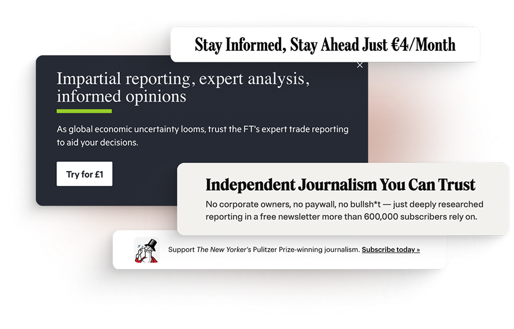
If mission, value, or reader-support messaging only appears at the paywall, it often feels opportunistic. The same message, introduced earlier through article pages, navigation cues, support framing, or offer context, can do much more work.
This is one of the core ideas behind our comparative analysis of publisher messaging and journeys: placement changes meaning. A value message introduced earlier helps build context. The same message delivered at the final moment is forced into the role of justification. See how leading publishers place mission, value, and brand messaging across subscription journeys?
5. Onboarding treated as separate from conversion
A lot of teams still separate onboarding from conversion too sharply.
But in publisher reality, they are part of the same commercial system. If a journey creates subscribers but fails to orient, engage, and reassure them quickly afterward, the conversion quality was weaker than it looked.
| What gets blamed | Where the issue often begins |
| Paywall conversion | weak value framing |
| registration drop-off | unclear exchange |
| low subscriber quality | poor onboarding logic |
| weak paywall response | bad article-to-offer progression |
This is not just a UX issue. It is a strategic one.
The subscription environment has matured. Publishers are operating in a market where:
Straightforward subscriber growth is no longer enough, and media companies need to sharpen their focus on churn, engagement, and lifetime value.
In that environment, publishers cannot afford to see the paywall as a standalone fix.
The strongest publisher journeys usually do three things better.
They build value before the ask
They do not wait until the paywall to explain why the relationship matters.
They treat journeys as systems
They connect the article experience, prompts, registration, offers, and onboarding rather than treating each as a separate workstream.
They optimise beyond conversion
They look at whether a journey is creating the right kind of subscriber experience, not just the immediate conversion event.
If a publisher suspects the journey is breaking before the paywall, the first step is not to rewrite one line of paywall copy and hope for the best.
Start by auditing:
This is where a subscription audit for publishers can be genuinely useful. It gives teams a way to see whether the problem is really the paywall — or whether the paywall is only surfacing upstream weaknesses in the journey.
Publisher subscription journeys usually do not break at one dramatic moment.
They break through weak progression, missing context, unclear value exchange, and too much friction before the final ask even appears. The paywall is often where the problem becomes visible, but not where it began.
That is why stronger subscription performance usually comes from looking at the whole system: the article page, the message, the registration step, the offer, the onboarding path, and the way those parts connect.
Request a subscription journey audit
Request your audit2026-06-094 min read

Where mission shows up, how it shapes conversion, and what publisher teams should test next
Subscription messaging is not only about access, price, or offers. For many publishers, it is also about identity: what the brand stands for, why the journalism matters, and why a reader should support it now.
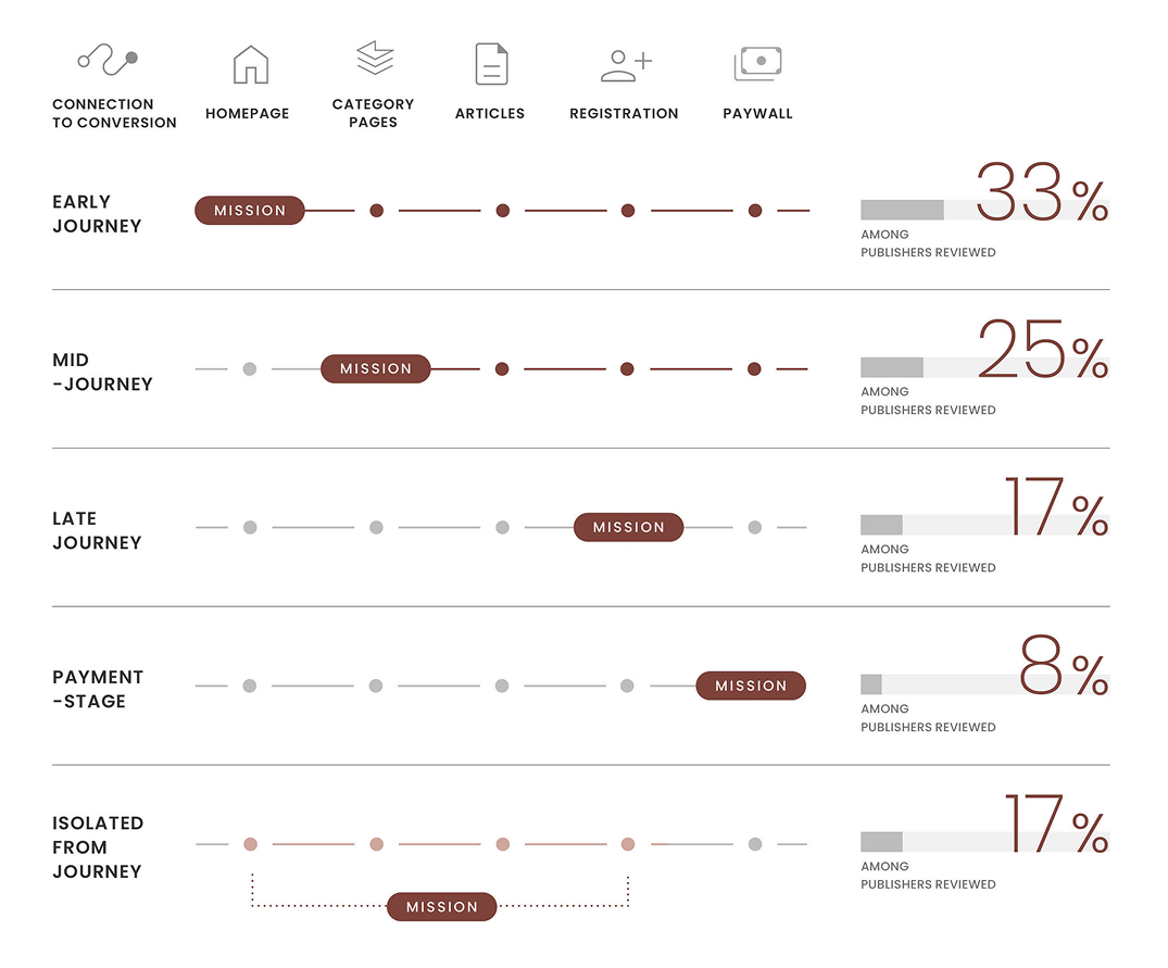
We recently mapped how a range of leading publishers handle this across their subscription journeys. The patterns were clear. There is no single formula, but there are recognisable strategic choices — and some are much more effective than others.
For publisher teams, one of the hardest messaging questions is also one of the most strategic:
Not whether to talk about it at all. Most premium publishers already do, in some form. The real question is where it belongs, how often it should appear, and how closely it should sit to conversion.
Some introduce it early, through homepage sections, editorial framing, or persistent navigation links. Others hold it closer to the moment of conversion, using registration prompts, paywalls, or support messaging to connect subscription directly to purpose. Others keep it more separate, limiting it to brand pages or About sections.
That choice matters more than it may seem.

When mission appears early, it helps build context. It gives readers a clearer sense of what the publication stands for before any ask appears. When it shows up only at the paywall, it becomes more of a justification for payment. And when it sits too far away from the journey entirely, it may feel less intrusive — but also less useful.
“Placement changes meaning.
The same message can build brand context, justify payment, or feel completely out of place depending on where it appears.”
Across the competitor journeys we reviewed, article pages carried the heaviest load.
This is where publishers most often combine:
For teams working on conversion, this is an important shift in thinking. The article page is not only where the ask happens. It is also where the value of the ask can be made clearer.
The strongest messaging feels integrated, not bolted on.
A second pattern was just as clear: the best approaches feel integrated with the subscription journey, not layered awkwardly on top of it.
A sticky bar, an in-content prompt, a ribbon, or a support message can all work. The real question is whether the message fits:
One of the biggest mistakes publisher teams make is treating mission and value messaging as something separate from optimisation.
In practice, they are part of the same journey.
If readers are only asked to subscribe, without being helped to understand why the relationship matters, the conversion moment becomes harder. If the value of subscribing is built earlier and more consistently, the ask feels more natural.
That is where stronger subscription journeys tend to differ.
The full analysis includes a broader comparison framework, pattern mapping across publishers, and practical prompts for publisher teams, including:
See how leading publishers place mission, value, and brand messaging across homepage, article, registration, and paywall journeys — and what those patterns suggest publisher teams should test next. 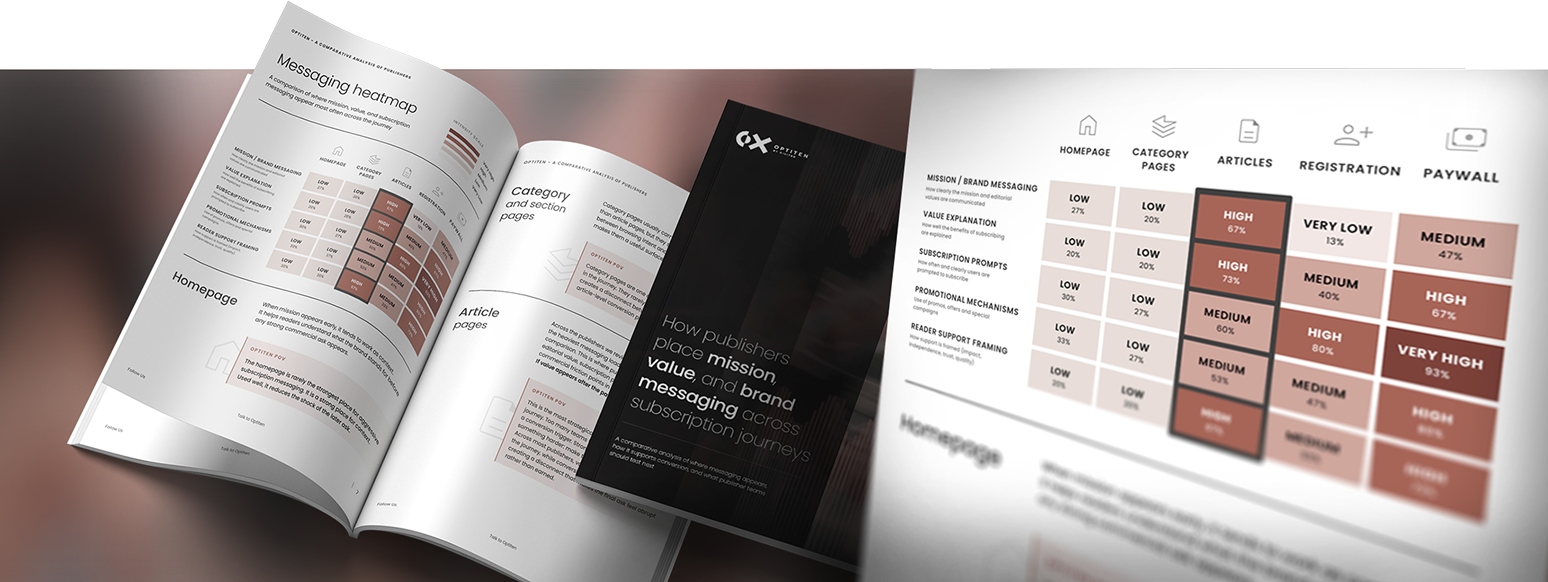
Request a subscription journey audit
Request your audit2026-06-0911 min read

A registration wall and a hard paywall are often treated as two versions of the same decision: how much content should a publisher give away before asking for something in return?
That framing is too simple.
A registration wall and a hard paywall solve different problems. A registration wall helps a publisher turn anonymous readers into known users. A hard paywall helps a publisher convert high-intent readers into paying subscribers.
Both can support reader revenue. Both can damage it if they appear at the wrong moment.
For most publishers, the stronger question is not:
Should we use a registration wall or a hard paywall?
It is:
At which point in the reader journey have we earned the right to ask for registration — and at which point have we earned the right to ask for payment?
That distinction matters because access strategy is not just a paywall decision. It affects audience growth, first-party data, newsletter sign-ups, advertising reach, subscription conversion, checkout performance, retention, and the way readers understand the value of the journalism.
“The best access strategy is not the one that blocks the most content. It is the one that asks for the right value exchange at the right moment.”
The short answer: they work best at different stages.
A registration wall usually works better when the publisher needs to build a known audience, collect first-party data, increase newsletter reach, and move readers into a longer subscription journey.
A hard paywall usually works better when the reader has enough intent, habit, or content need to justify a direct subscription ask.
That means the answer is rarely one or the other.
For many publishers, the stronger model looks more like this:
A registration wall asks readers to create a free account or sign in before accessing more content. The reader does not pay, but they exchange information — usually an email address, login, or basic profile data — for continued access.
For publishers, the value is not simply the email address. The value is the shift from anonymous traffic to a known relationship.
A registered reader can be recognised across visits, invited into newsletters, shown more relevant messages, segmented by behaviour, and gradually moved toward subscription.
A hard paywall blocks access unless the reader has an active paid subscription or entitlement. The value exchange is direct: this content is for paying subscribers.
Hard paywalls work best when the publisher has a strong answer to one question:
What is the reader paying for that they cannot easily get elsewhere?
That could be specialist reporting, exclusive analysis, local insight, professional intelligence, distinctive opinion, archives, data, or community access.
The difference is important. Registration is mainly about building the relationship. A hard paywall is mainly about converting existing intent.
The real decision is not wall type. It is reader stage.
The same reader can be a poor candidate for a hard paywall on their first visit and a strong candidate a few weeks later.
A first-time visitor from search may not know the brand, understand the value proposition, or have any habit with the publication. Asking that reader to subscribe immediately may be commercially premature.
A reader who has returned several times, read deeply in one topic area, signed up to a newsletter, and visited the offer page is different. They have shown intent. A subscription ask is more likely to feel relevant.
This is why access strategy should be based on journey stage, not just content rules. This is where many publisher journeys break. They ask too much too early, or too little for too long. Both are expensive. 
A registration wall usually works better when the reader is valuable, but not ready to pay yet.
That does not mean the reader has low value. It means the relationship is still forming.
When the publisher needs more known users
Anonymous traffic is difficult to understand, target, retain, or convert.
A registration wall gives the publisher a way to identify repeat readers and build a more useful audience base. This matters for newsletter growth, personalisation, segmentation, churn prevention, and long-term subscription conversion.
For publishers trying to reduce reliance on anonymous traffic, registration is often the first serious step toward a more controlled reader relationship.
When the value exchange can be explained clearly
A registration wall should answer the reader’s quiet question:
Why are you asking me to do this?
Weak registration walls feel like admin. Strong registration walls make the exchange clear.
For example, the reader may be asked to create a free account to continue reading, get more articles, follow topics, save stories, manage newsletters, or receive more relevant recommendations.
The clearer the benefit, the less the wall feels like a blockage.
A hard paywall usually works better when the reader has stronger intent and the content has clearer paid value.
It is not the right tool for every article, every audience segment, or every stage of the journey.
When the content is genuinely differentiated
Hard paywalls need content that feels worth paying for.
That might include exclusive reporting, specialist analysis, local coverage readers cannot easily replace, professional insight, premium opinion, data-led journalism, member-only benefits, archives, or tools.
A hard paywall around weakly differentiated content can make the product feel smaller without making the subscription feel more valuable.
When the reader has already shown intent
Hard paywalls work better when they are shown to readers who have demonstrated interest.
Useful signals might include repeat visits, high article depth, regular visits to one topic area, newsletter engagement, previous registration, offer page visits, trial starts, or lapsed subscriber behaviour.
A hard paywall may perform poorly across all traffic but strongly among high-propensity segments. That is why publishers should avoid judging paywall performance only at site-wide level.
When too much free access is weakening subscription discipline
Some publishers have the opposite problem: readers can access enough content for free that subscription never feels necessary.
In that case, the issue is not that the paywall is too strong. It may be too weak, too inconsistent, or too easy to avoid.
A hard paywall can help when premium value needs to be protected more clearly. But it should still be applied with care. The goal is not to punish loyal readers. The goal is to make the value exchange more coherent.
One of the biggest mistakes publishers make is treating registration as simply a less aggressive paywall.
That misses the point.
A registration wall should not just delay the subscription ask. It should change what the publisher knows about the reader and what the reader experiences next.
If a registered user sees the same messages, same offers, same newsletter prompts, same recommendations, and same paywall treatment as an anonymous user, the registration strategy is underused.
Registration should help answer:
| Decision question | Registration wall is usually stronger when… | Hard paywall is usually stronger when… |
| Reader relationship | The reader is anonymous or early-stage | The reader is known, loyal, or high-intent |
| Main business goal | You need first-party data, newsletter growth, and habit formation | You need direct subscription conversion and premium access control |
| Content type | Content supports discovery, frequency, or broad engagement | Content is exclusive, specialist, or high-value |
| Revenue balance | You need to protect reach and advertising value | You can restrict access for subscription value |
| Journey maturity | Segmentation and onboarding need to be developed | Offer, checkout, entitlements, and onboarding are already strong |
| Testing goal | You want to learn who readers are and what they value | You want to test conversion pressure, pricing, and paid access |
| Main risk | Too much friction too early | Too much free access for readers who are ready to pay |
This framework is useful because it moves the decision away from preference and toward operating logic.
The right model depends on reader behaviour, content value, revenue mix, journey maturity, and the publisher’s ability to act on the data it collects.
The right access strategy should be tested, not guessed.
A publisher does not need to test everything at once. But it should test the points where the reader is being asked to exchange something: attention, data, registration, money, or loyalty.
Useful areas to test include:
The most important question is not simply which version gets the most registrations or conversions.
It is:
Which version moves the right readers to the right next step?
A registration wall that creates many low-quality accounts may not help subscription revenue. A hard paywall that improves immediate conversion but damages audience growth may not be a long-term win.
Registration walls and hard paywalls should not be judged by the same metrics.
For registration walls, useful metrics include:
For hard paywalls, useful metrics include:
The danger is optimising one number in isolation.
A registration wall that creates thousands of low-quality accounts may not help subscription revenue. A hard paywall that improves immediate conversion but damages audience growth may not be a long-term win.
The better question is:
“Does this access model move the right readers to the right next step?”
So, which works better for publishers: a registration wall or a hard paywall?
A registration wall works better when the publisher needs to build a known audience, collect first-party data, and create a stronger path toward subscription.
A hard paywall works better when the reader has enough intent and the content has enough value to justify a direct payment ask.
But for many publishers, the best answer is both.
Registration should not be a polite obstacle. It should be the beginning of a better reader relationship.
A hard paywall should not be a blunt restriction. It should be a targeted subscription moment shown when the reader, content, offer, and timing are aligned.
The opportunity is not simply to choose the right wall. It is to make sure access rules, registration, messaging, offers, checkout, onboarding, reporting, and experimentation work together as one subscription journey.
If those pieces are disconnected, performance will usually suffer somewhere: fewer registrations, weaker conversion, unclear reporting, slower testing, or more friction for readers.
That is where a focused audit can help. Not just to ask whether the registration wall or hard paywall is “working”, but to understand whether the whole journey is doing its job.
Request a subscription journey audit
Request your audit2026-06-096 min read

Most publisher subscription journeys do not fail because the product has no value.
They fail because the value is not made clear at the moment the reader is being asked to act.
A reader may be asked to register before they understand the benefit. They may hit a paywall before the paid value feels obvious. They may land on an offer page that lists features but does not explain why those features matter.
For publishers, value proposition is not just a line of copy on the subscription page. It should appear across the whole journey: registration, paywall, offer page, checkout, onboarding and retention.
The strongest publisher value propositions answer one question clearly:
“Why should this reader take the next step now?
A publisher value proposition is the reason a reader believes an account, newsletter, subscription or membership is worth their attention, data or money.
It should make the exchange clear.
Register because the experience becomes more relevant.
Subscribe because the coverage helps you understand something important.
Stay because the product has become part of your routine.
The best value propositions are specific to the reader’s stage in the subscription journey.
Below are six useful value proposition types publishers can use across registration, paywalls, offer pages and onboarding.
1. The access value proposition
This is the most familiar subscription value proposition. It works when the paid product clearly gives readers access to something they cannot get for free.
It is especially useful for:
If the value proposition is access, make it specific. The reader should understand not only that they get more content, but why that content is worth paying for.
2. The expertise value proposition
The expertise value proposition works well for publishers with strong specialist authority: business, politics, finance, science, policy, culture, sport or industry coverage.
The reader is not only paying for articles. They are paying for judgement, context and expertise.
This value proposition is useful when the subscription product helps readers:
3. The habit value proposition
This value proposition is about routine.
It works well for newsletters, apps, briefings, podcasts and daily editions. It is less about “unlocking content” and more about becoming part of the reader’s day.
Habit-based value propositions are useful because retention often depends on repeated use, not just initial conversion.
They work well in:
4. The brand world value proposition
Some publisher value propositions are not built around access, price or features. They are built around the world the publication invites the reader into.
This works best for publishers with a distinctive voice, strong brand recognition or a clear editorial personality.
It is especially useful for:
5. The mission value proposition
This value proposition works when the reader feels aligned with the publisher’s role, values or public purpose.
It is often powerful, but it has to be handled carefully. “Support us” is not always enough. The reader still needs to understand what their support makes possible.
A stronger version connects mission with reader benefit:
“Support independent reporting that helps our community stay informed, represented and heard.”
Mission-led messaging can be useful in:
6. The proof and prestige value proposition
Some value propositions work by reducing doubt. They show the reader that the publication is worth paying for because it has recognised authority, awards, reputation or cultural weight.
The New Yorker’s “Pulitzer Prize-winning journalism” prompt is a proof-based value proposition. It gives the subscription ask credibility without needing to explain every benefit.
This type of messaging is useful when the publisher has strong trust signals, such as:
The best publisher value proposition examples work because they are specific to the moment.
A first-time reader may need trust.
A repeat reader may need relevance.
A registered reader may need a reason to pay.
A new subscriber may need help building a habit.
An existing subscriber may need a reminder of what they rely on.
That is why value proposition should not live only on the subscription page.
It should shape the whole subscription journey: registration, paywall messaging, offer pages, checkout, onboarding and retention.
If those messages feel disconnected, the issue may not only be copy. It may be the journey logic behind it.
Request a subscription journey audit
Request your audit